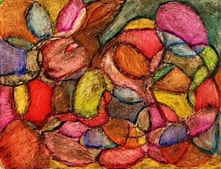
In art class this week we studied artistic genius Pablo Picasso (1881 – 1973). He co-founded Cubism and produced a monumental 20,000 artworks during his 70-year career. Picasso’s torrential outpouring of work was so extensive and complex that art historians have divided it into individual periods. A prodigy in his youth, Picasso enrolled in advanced classes at Barcelona’s Royal Academy of Art at age 15. The strong geometric forms of his groundbreaking Cubist works redefined art as a medium that could digress from literal images of reality. Passionately creative in every genre from primitive art to sketches to Surrealism, Picasso profoundly impacted 20th century art. This is from the short biography at allposters.com.
There are many otherwise good artists who can create a beautiful 2D line drawing, but when trying to give it depth through light, dark, and middle shading values, sometimes they fall short. An excellent exercise for any artist, whether beginner or expert is gray value study. Every color has a value. It can be thought of as intensity or vibrancy as well. If you use a crayon and color with a lot of pressure you will create a deeper value than you would have had you colored lightly with less pressure. The same goes for pencil and they gray values created. It applies to line work as well with hatching and cross-hatching, though the latter can create deeper value simply with more lines spaced closer together. Below you will see an excellent exercise to practice your pencil shading work with.

You simply start by making the first box as dark as you can and make each box subsequently lighter. There are only six boxes in each row. There are actually so many values in between these, but you can challenge yourself later by adding more boxes. For real beginners you may want to start with fewer boxes. Q-tips can also come in handy for blending and picking up some graphite from a heavy area and using it to shade as well. Hatching is simply a sequence of lines moving in the same direction. Like this //////. You can achieve lighter or deeper values based on the heaviness of your lines and the spacing between them. For a lighter value, use lighter lines space further apart. For deeper values, use heavier lines spaced closer together. Cross hatching is very similar to hatching except you use lines that cross each other like this XXXXX. The more layers of lines going in different directions the deeper the value will appear. The tip for hatching applies here as well with pressure and spacing. The final row is reserved for scribbling. Here is where you get to have fun and use any kind of lines you want, just make sure they get lighter as you go. The more pressure you use and the less white space you leave will result in deeper values and vice-versa. This acts as a good warm up for this next project though it is a great thing to practice over and over- just like scales on a musical instrument.
Project Picasso
Materials needed
drawing paper
pencils
sharpie markers
Q-Tips
Procedure
1. Have kids draw a large oval shape. It should take up most of the paper.
2. Have the kids draw curves down the middle of the oval to create a profile. There should be a forehead, nose, lips, and chin. We are creating a view of a profile and a full face. Two points of view to be seen simultaneously. This was often a goal of cubism, creating viewpoint from different planes to be viewed all at the same time.
3. Next have the kids draw in eyes. They can make the eyes shapes any shape they want because this is an abstract project, but to get a more realistic shape, I always tell the kids to start by making a "rainbow curve" on the top under it, to make a "happy face smile"
4. After the eyes are in, have them find the lips and draw a sideways "V"to define the edge of the mouth. Repeat on the other side.
5. Now they can add eyebrows, ears, hair, and a small "C", normally or backwards depending on which direction the profile nose points.
6. Now have them think of 2-3 shapes. I used figure 8's and stars for the slide show.
Have them draw these shapes right over the face. Have them make the shapes very large. The shapes should overlap each other. They can use the sharpies to go over the pencil lines they like, avoiding any they didn't like. When they are done they can erase any lines they don't like and it won't affect the darkened lines.
7. Have them color in each space that has been made from the overlapping lines. There are rules for coloring though. No two same values can touch each other. So no two white or black shapes can touch each other except at the corners. As well no two gray values that are too similar can touch. Encourage kids to put contrasting values next to each other to create more interest and drama. They can use any type of shading technique in this step. What matters is the value. They can use the Q-Tips for blending as I discussed above.
These projects look great mounted or matted with black card stock or mat board.
This is a great book for any aspiring artist. It says it's for kids but any artist could benefit from the lessons in this book.
Read more...


